Elevating a Brand Through Effective Illustrations and Branding
Role: Art Director, Illustrator
Programs: Illustrator, Figma
Set for Life Insurance is an independent insurance agency specializing in individual life, disability, and long-term care insurance. Specializing in helping medical residents, business owners, attorneys, veterinarians, professional athletes, and other high-income professionals get the insurance coverage they need, the Set for Life team was looking for a way to bolster their brand by focusing on their unique story and conveying their client-centric approach to insurance.
I teamed up with a local agency and their small team consisting of a Project Manager, Creative Director, and one other Art Director to provide brand direction, plus a set of illustrations and icons that would live within a refreshed Set for Life Insurance experience featured throughout their website.

Exploring Solutions
In the early phases of this project, I worked to provide three distinct options, providing moodboards and supplying visual examples of image and illustration, typography, and color approaches.
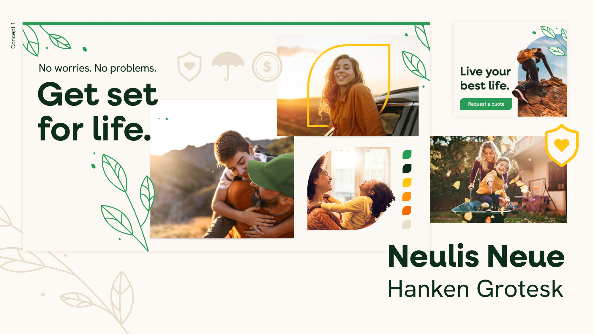
Concept 1
Concept 1 embraces a photography-driven approach, featuring warm, aspirational imagery complemented by a simplified iconography and illustration style for visual flair. A clean, modern typeface enhances readability, while the color palette harmonizes with the photography to create a cohesive and inviting aesthetic.
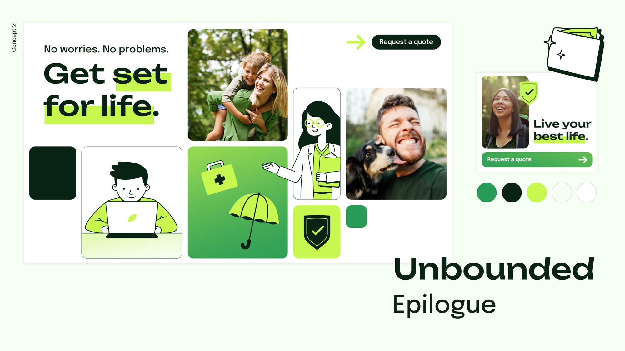
Concept 2
Concept 2 is meant to be an exploration of storytelling primarily through illustrations, while lifestyle photography stands in to support. This brand approach embodies a sleek aesthetic, blending a monochromatic color palette with a modern punch. Structured yet fluid, the design integrates rounded corners, grids, and soft gradients while clean-lined typefaces infused with personality ensure a refined yet approachable feel. Lifestyle imagery leans into lush greens to evoke freshness, and the use of illustrations reflects the target audience, adding depth and relatability to the visual identity.
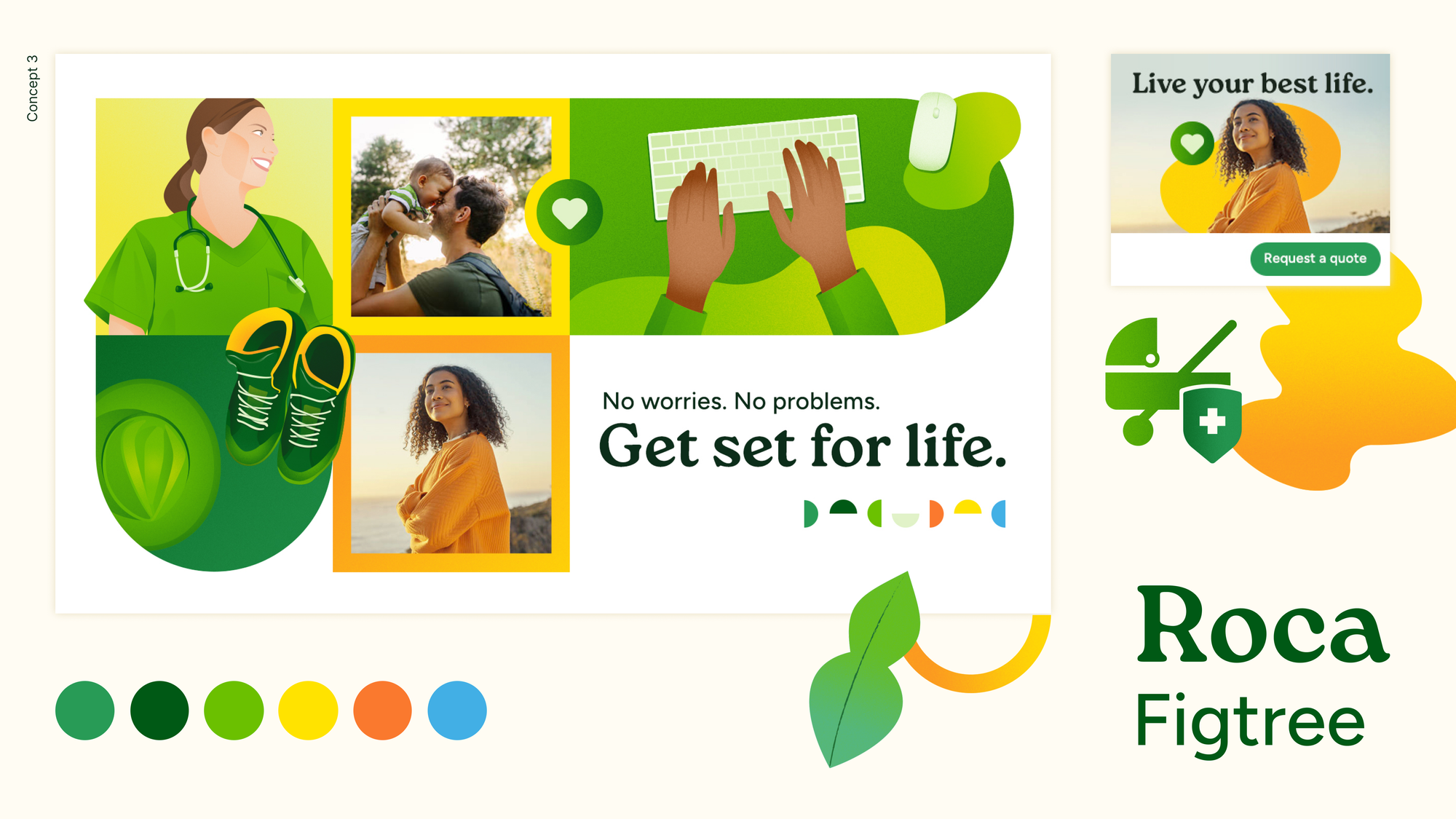
Concept 3
The final concept focuses on being a middle ground between a photography- or illustration-heavy concept. With expressive illustrations, accents, icons, and photography showcasing happy moments, it felt important to provide this direction with a bright and bold color palette that could effectively capture attention. Modern and friendly typography supports the ethos of this concept as well, creating a sense of warmth.
Storytelling through Illustration
The Set for Life Insurance team ultimately chose to run with the second concept, leaning into the idea of using illustrations to tell a story and using a color palette that complements their namesake green.
I moved into the final phase of work by developing illustrations for their website, leaning into the agency's concept of depicting a hero character going through a timeline of key life events, such as graduation, marriage, having a baby, getting a promotion, and retirement. This idea captures the essence of life's biggest moments, showing how insurance is a constant support, ensuring that each new chapter is met with security and peace of mind.


While this hero character was first made for the hero image, the team loved her so much, we moved to include her in other illustrations.
Iconography and Secondary Page Illustrations
For smaller modules that highlighted Set for Life Insurance's offerings and customer resources, I was asked to provide icons. In developing this small set, I wanted to ensure that these felt related to the overall style that was established with the larger illustrations and stuck with line work that was highlighted by a singular accent color.

Finally, for pages and modules aside from the homepage hero, I set out illustrating a few more vignettes that would support concepts of disability, life, and long-term care insurance as well as resources and requesting a quote.